• For Individuals
  • For Businesses
  • For Universities
  • For Governments
Coursera
Log In
Join for Free
Coursera
  • Browse
  • Data Visualization

Data Visualization Courses

Learn data visualization techniques for presenting data effectively. Understand how to create charts, graphs, and dashboards using various tools.

Skip to search results

Filter by

Subject
Required
 *

Language
Required
 *

The language used throughout the course, in both instruction and assessments.

Learning Product
Required
 *

Build job-relevant skills in under 2 hours with hands-on tutorials.
Learn from top instructors with graded assignments, videos, and discussion forums.
Learn a new tool or skill in an interactive, hands-on environment.
Get in-depth knowledge of a subject by completing a series of courses and projects.
Earn career credentials from industry leaders that demonstrate your expertise.
Earn career credentials while taking courses that count towards your Master’s degree.
Earn your Bachelor’s or Master’s degree online for a fraction of the cost of in-person learning.
Complete graduate-level learning without committing to a full degree program.
Earn a university-issued career credential in a flexible, interactive format.

Level
Required
 *

Duration
Required
 *

Skills
Required
 *

Subtitles
Required
 *

Educator
Required
 *

Find the best Data Visualization course for your goals

  • C

    Coursera Project Network

    Overview of Data Visualization

    Skills you'll gain: Data Visualization, Data Literacy, Data Presentation, Google Sheets, Data Compilation, Data Visualization Software, Graphing, Spreadsheet Software

    4.7
    Rating, 4.7 out of 5 stars
    ·
    429 reviews

    Beginner · Guided Project · Less Than 2 Hours

  • Status: Free
    Free
    C

    Coursera Project Network

    How To Visualize Your Data Using Microsoft Powerpoint

    Skills you'll gain: Presentations, Microsoft PowerPoint, Data Visualization, Data Storytelling, Video Editing

    4.5
    Rating, 4.5 out of 5 stars
    ·
    251 reviews

    Beginner · Guided Project · Less Than 2 Hours

  • C

    Coursera Project Network

    Introduction to Data Analysis using Microsoft Excel

    Skills you'll gain: Microsoft Excel, Excel Formulas, Spreadsheet Software, Pivot Tables And Charts, Data Analysis, Data Manipulation, Microsoft Office, Data Mining

    4.7
    Rating, 4.7 out of 5 stars
    ·
    4.3K reviews

    Intermediate · Guided Project · Less Than 2 Hours

  • C

    Coursera Project Network

    Getting Started with Microsoft Excel

    Skills you'll gain: Microsoft Excel, Excel Formulas, Spreadsheet Software, Microsoft Office, Data Entry, Microsoft 365

    4.6
    Rating, 4.6 out of 5 stars
    ·
    13K reviews

    Intermediate · Guided Project · Less Than 2 Hours

  • C

    Coursera Project Network

    Data Visualization using Plotly

    Skills you'll gain: Plotly, Exploratory Data Analysis, Scatter Plots, Plot (Graphics), Data Visualization, Data Visualization Software, Interactive Data Visualization, Python Programming

    4
    Rating, 4 out of 5 stars
    ·
    49 reviews

    Intermediate · Guided Project · Less Than 2 Hours

  • C

    Coursera Project Network

    Create Charts and Dashboard using Google Sheets

    Skills you'll gain: Dashboard, Google Sheets, Spreadsheet Software, Pivot Tables And Charts, Data Visualization, Data Visualization Software, Data Presentation, Interactive Data Visualization, Excel Formulas, Data Analysis, Data Manipulation

    4.6
    Rating, 4.6 out of 5 stars
    ·
    635 reviews

    Beginner · Guided Project · Less Than 2 Hours

What brings you to Coursera today?

  • C

    Coursera Project Network

    Python for Data Visualization: Matplotlib & Seaborn

    Skills you'll gain: Matplotlib, Histogram, Plot (Graphics), Data Visualization, Seaborn, Scatter Plots, Data Visualization Software, Statistical Visualization, Graphing, Python Programming

    4.6
    Rating, 4.6 out of 5 stars
    ·
    72 reviews

    Beginner · Guided Project · Less Than 2 Hours

  • C

    Coursera Project Network

    Storytelling With Data

    Skills you'll gain: Data Storytelling, Data Presentation, Storytelling, Data Visualization, Verbal Communication Skills, Data Analysis, Business Communication, Action Oriented, Drive Engagement

    4.5
    Rating, 4.5 out of 5 stars
    ·
    269 reviews

    Beginner · Guided Project · Less Than 2 Hours

  • C

    Coursera Project Network

    Data Visualization using Plotnine and ggplot

    Skills you'll gain: Exploratory Data Analysis, Box Plots, Plot (Graphics), Data Visualization, Ggplot2, Data Visualization Software, Statistical Visualization, Scatter Plots, Histogram, Graphing, Python Programming

    4.6
    Rating, 4.6 out of 5 stars
    ·
    16 reviews

    Intermediate · Guided Project · Less Than 2 Hours

  • C

    Coursera Project Network

    Data Visualization using Bokeh

    Skills you'll gain: Spatial Data Analysis, Data Visualization Software, Data Visualization, Geospatial Information and Technology, Interactive Data Visualization, Scatter Plots, Software Installation, Python Programming

    4.1
    Rating, 4.1 out of 5 stars
    ·
    15 reviews

    Intermediate · Guided Project · Less Than 2 Hours

  • Status: Free
    Free
    C

    Coursera Project Network

    Power BI for Beginners: Build your First Report

    Skills you'll gain: Data Transformation, Power BI, Data Manipulation, Data Cleansing, Dashboard, Data Visualization, Data Import/Export, Interactive Data Visualization, Data Visualization Software, Data Storytelling, Data Modeling, Microsoft Power Platform

    4.6
    Rating, 4.6 out of 5 stars
    ·
    133 reviews

    Beginner · Guided Project · Less Than 2 Hours

  • C

    Coursera Project Network

    Google Ads for Beginners

    Skills you'll gain: Google Ads, Keyword Research, Target Audience, Pay Per Click Advertising, Search Engine Marketing, Advertising Campaigns, Campaign Management, Online Advertising, Digital Advertising, Marketing, Digital Marketing, Return On Investment

    4.4
    Rating, 4.4 out of 5 stars
    ·
    5.8K reviews

    Beginner · Guided Project · Less Than 2 Hours

Data Visualization learners also search

beginner data visualization
data visualization projects
advanced data visualization
charting
exploratory data analysis
data wrangling
beginner data analysis
data analysis
1234…64

In summary, here are 10 of our most popular data visualization courses

  • Overview of Data Visualization: Coursera Project Network
  • How To Visualize Your Data Using Microsoft Powerpoint: Coursera Project Network
  • Introduction to Data Analysis using Microsoft Excel: Coursera Project Network
  • Getting Started with Microsoft Excel: Coursera Project Network
  • Data Visualization using Plotly: Coursera Project Network
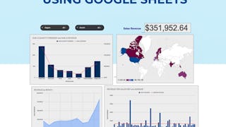
  • Create Charts and Dashboard using Google Sheets: Coursera Project Network
  • Python for Data Visualization: Matplotlib & Seaborn: Coursera Project Network
  • Storytelling With Data: Coursera Project Network
  • Data Visualization using Plotnine and ggplot: Coursera Project Network
  • Data Visualization using Bokeh: Coursera Project Network

Frequently Asked Questions about Data Visualization

Data visualization, which is sometimes called information visualization, is the representation of datasets through graphical means such as charts, maps, visual analytics interfaces such as dashboards, and interactive visualizations. A picture is worth a thousand words - or a thousand lines of a spreadsheet - and the ability to convey key relationships within complex datasets and insights from data analysis in a visually compelling way is critically important to making sense of our world.

While data visualizations may be as simple as a bar graph created in Microsoft Excel, the complexity, size, and velocity of datasets in the big data era often demand more powerful approaches. Specialized programs such as Tableau Software and the D3.js JavaScript library are widely used in the business world to create dynamic data visualizations, which may even incorporate real-time data streams. For particularly complex tasks, data virtualization software may also be used as middleware to integrate multiple sources and types of data into a format suitable for use with these visualization programs.‎

The ability to create data visualizations are increasingly expected in a variety of jobs, making these skills highly valuable as well as portable. Whether you’re a financial analyst at a hedge fund displaying a real-time dashboard of portfolio risk or a data journalist creating an interactive visualization map of the spread of Covid-19, compelling data visualizations can increase the impact of your work and give you an edge in your career.

Management analysts are particularly attuned to the value of good data visualizations. These consultants must make convincing recommendations for organizational changes to upper-level management and busy executives, and powerful graphics can be essential to making these cases effectively. According to the Bureau of Labor Statistics, management analysts earned a median annual wage of $85,260 as of 2019, and these jobs are expected to grow much faster than average as more and more companies seek advice on navigating today’s fast-changing business world.‎

Yes! Coursera lets you learn remotely about data visualization and related topics with courses and Specializations from top-ranked schools like New York University, University of California, Davis, and the University of Illinois at Urbana-Champaign. You can also take courses from industry leaders like IBM and PwC, one of the top management consultancies in the world. Online learning with Coursera is an especially good fit for mid-career professionals seeking to add data visualization capabilities to their skill set, as you can complete coursework on a flexible schedule that fits into your existing work life.‎

Some skills you might want to have before learning data visualization include mathematics, Excel, and some coding experience. Specifically, learning popular programming languages like R and Python can be useful for analyzing the data you want to present in a visual format. Strong data analysis skills are usually essential because you should be able to interpret data accurately to avoid misleading the people viewing the final product. In addition to technology skills, you can put to use other skills in a data visualization role, such as problem-solving, artistic skills, and communication skills.‎

The right kind of person for a role in data visualization has a combination of technology, business, and communication skills. They typically know how to collect, analyze, and interpret data quickly and accurately using programming languages like R, Python, and JavaScript and tools such as Tableau, PowerBI, or Microsoft Excel. Someone with strong communication skills also tends to work well in this field. Being able to listen to the needs of the client and create a data visualization tool that accurately represents the data in a way that the audience understands is useful.‎

If you're comfortable working with large amounts of data and are passionate about making sure people understand the available data about a project, program, or concern, learning data visualization may be a good choice for you. You'll likely have opportunities to help others by sharing important data in a format that’s visually appealing and easy to interpret. Learning data visualization can add to your skillset if you've previously studied or worked as a graphic designer or data analyst. You may choose to learn a programming language so you can develop your own data warehouse or another visualization tool to showcase the data you analyze, or you can decide to explore the variety of methods used to create visual displays of data.‎

If you're looking for the best free data visualization courses available, try auditing one of these courses Data Visualization Specialization, Excel Data Analytics and Visualization Specialization, Fundamentals of Data Visualization Course, Data Visualization and Dashboarding with R Specialization or Data Analysis and Visualization Foundations Specialization. In the audit version, you can assess most of the material but will not be able to submit assignments or receive grades or a certificate for your work unless you upgrade.‎

For those seeking to get started in data visualization, the Data Visualization with Tableau offers valuable insight into topics such as practices, theories, and tools used in data visualization. Additionally, the Data Analysis and Visualization Foundations Specialization covers the fundamentals of data visualization. For those wishing to learn R programming for data visualization methods, the Data Visualization and Dashboarding with R Specialization is a great option. Those looking for data visualization with Python can sign up for Python for Data Visualization and for Tableau, Data Visualization with Tableau provides an introduction to analytics and data visualization.‎

For those looking to excel in advanced data visualization, Coursera offers an extensive range of courses. These include the Excel, Data Visualization & Analytics Specialization, Fundamentals of Data Visualization, Python for Data Visualization, Excel for Data Visualization, and Data Visualization Project.‎

Online Data Visualization courses offer a convenient and flexible way to enhance your knowledge or learn new Data Visualization skills. Choose from a wide range of Data Visualization courses offered by top universities and industry leaders tailored to various skill levels.‎

When looking to enhance your workforce's skills in Data Visualization, it's crucial to select a course that aligns with their current abilities and learning objectives. Our Skills Dashboard is an invaluable tool for identifying skill gaps and choosing the most appropriate course for effective upskilling. For a comprehensive understanding of how our courses can benefit your employees, explore the enterprise solutions we offer. Discover more about our tailored programs at Coursera for Business here.‎

This FAQ content has been made available for informational purposes only. Learners are advised to conduct additional research to ensure that courses and other credentials pursued meet their personal, professional, and financial goals.

Other topics to explore

Arts and Humanities
338 courses
Business
1095 courses
Computer Science
668 courses
Data Science
425 courses
Information Technology
145 courses
Health
471 courses
Math and Logic
70 courses
Personal Development
137 courses
Physical Science and Engineering
413 courses
Social Sciences
401 courses
Language Learning
150 courses

Coursera Footer

Skills

  • Artificial Intelligence (AI)
  • Cybersecurity
  • Data Analytics
  • Digital Marketing
  • English Speaking
  • Generative AI (GenAI)
  • Microsoft Excel
  • Microsoft Power BI
  • Project Management
  • Python

Certificates & Programs

  • Google Cybersecurity Certificate
  • Google Data Analytics Certificate
  • Google IT Support Certificate
  • Google Project Management Certificate
  • Google UX Design Certificate
  • IBM Data Analyst Certificate
  • IBM Data Science Certificate
  • Machine Learning Certificate
  • Microsoft Power BI Data Analyst Certificate
  • UI / UX Design Certificate

Industries & Careers

  • Business
  • Computer Science
  • Data Science
  • Education & Teaching
  • Engineering
  • Finance
  • Healthcare
  • Human Resources (HR)
  • Information Technology (IT)
  • Marketing

Career Resources

  • Career Aptitude Test
  • Examples of Strengths and Weaknesses for Job Interviews
  • High-Income Skills to Learn
  • How Does Cryptocurrency Work?
  • How to Highlight Duplicates in Google Sheets
  • How to Learn Artificial Intelligence
  • Popular Cybersecurity Certifications
  • Preparing for the PMP Certification
  • Signs You Will Get the Job After an Interview
  • What Is Artificial Intelligence?

Coursera

  • About
  • What We Offer
  • Leadership
  • Careers
  • Catalog
  • Coursera Plus
  • Professional Certificates
  • MasterTrack® Certificates
  • Degrees
  • For Enterprise
  • For Government
  • For Campus
  • Become a Partner
  • Social Impact
  • Free Courses
  • Share your Coursera learning story

Community

  • Learners
  • Partners
  • Beta Testers
  • Blog
  • The Coursera Podcast
  • Tech Blog

More

  • Press
  • Investors
  • Terms
  • Privacy
  • Help
  • Accessibility
  • Contact
  • Articles
  • Directory
  • Affiliates
  • Modern Slavery Statement
  • Manage Cookie Preferences
Learn Anywhere
Download on the App Store
Get it on Google Play
Logo of Certified B Corporation
© 2025 Coursera Inc. All rights reserved.
  • Coursera Facebook
  • Coursera Linkedin
  • Coursera Twitter
  • Coursera YouTube
  • Coursera Instagram
  • Coursera TikTok