• For Individuals
  • For Businesses
  • For Universities
  • For Governments
Coursera
Log In
Join for Free
Coursera
  • Browse
  • Run Chart
Skip to search results

Filter by

Subject
Required
 *

Language
Required
 *

The language used throughout the course, in both instruction and assessments.

Learning Product
Required
 *

Build job-relevant skills in under 2 hours with hands-on tutorials.
Learn from top instructors with graded assignments, videos, and discussion forums.
Learn a new tool or skill in an interactive, hands-on environment.
Get in-depth knowledge of a subject by completing a series of courses and projects.
Earn career credentials from industry leaders that demonstrate your expertise.

Level
Required
 *

Duration
Required
 *

Skills
Required
 *

Subtitles
Required
 *

Educator
Required
 *

Results for "run chart"

  • Status: Free Trial
    Free Trial
    I

    IBM

    Data Visualization and Dashboards with Excel and Cognos

    Skills you'll gain: Data Storytelling, Data Visualization, Data Visualization Software, Dashboard, IBM Cognos Analytics, Tree Maps, Scatter Plots, Data Analysis, Pivot Tables And Charts, Microsoft Excel, Histogram

    4.7
    Rating, 4.7 out of 5 stars
    ·
    4.3K reviews

    Beginner · Course · 1 - 4 Weeks

  • Status: Free Trial
    Free Trial
    J

    Johns Hopkins University

    Getting Started with Data Visualization in R

    Skills you'll gain: Rmarkdown, Data Visualization, Statistical Visualization, Ggplot2, Data Import/Export, Data Visualization Software, R Programming, Tidyverse (R Package), Statistical Reporting, Data Manipulation, Scatter Plots, Data Wrangling, Histogram

    4.7
    Rating, 4.7 out of 5 stars
    ·
    294 reviews

    Beginner · Course · 1 - 4 Weeks

  • C

    Coursera Project Network

    Data Visualization using Plotly

    Skills you'll gain: Plotly, Exploratory Data Analysis, Scatter Plots, Plot (Graphics), Data Visualization, Data Visualization Software, Interactive Data Visualization, Python Programming

    4
    Rating, 4 out of 5 stars
    ·
    49 reviews

    Intermediate · Guided Project · Less Than 2 Hours

  • Status: New
    New
    Status: Free Trial
    Free Trial
    E

    EDUCBA

    Seaborn with Python: Data Visualization for Beginners

    Skills you'll gain: Seaborn, Data Literacy, Plot (Graphics), Matplotlib, Scatter Plots, Statistical Visualization, Data Presentation, Data Visualization Software, Box Plots, Descriptive Statistics, Exploratory Data Analysis, Statistical Analysis, Pandas (Python Package), NumPy

    Mixed · Course · 1 - 4 Weeks

  • C

    Coursera Project Network

    Use RACI charts for work management with Asana

    Skills you'll gain: Cross-Functional Collaboration, Project Management Software, Workflow Management, Organizational Skills, Project Management, Prioritization

    4.7
    Rating, 4.7 out of 5 stars
    ·
    15 reviews

    Beginner · Guided Project · Less Than 2 Hours

  • Status: Free Trial
    Free Trial
    J

    Johns Hopkins University

    Advanced Data Visualization with R

    Skills you'll gain: Rmarkdown, Tidyverse (R Package), Ggplot2, Spatial Data Analysis, Data Visualization Software, Statistical Visualization, Geospatial Information and Technology, Data Manipulation, Scatter Plots, Plotly, Interactive Data Visualization, R Programming, Data Mapping, Animations

    4.9
    Rating, 4.9 out of 5 stars
    ·
    79 reviews

    Mixed · Course · 1 - 4 Weeks

  • Status: New
    New
    Status: Free Trial
    Free Trial
    G

    Google

    Loops and Strings

    Skills you'll gain: Data Structures

    Intermediate · Course · 1 - 4 Weeks

  • Status: New
    New
    Status: Free Trial
    Free Trial
    U

    University of Pittsburgh

    Tableau, Networks & Time Series Data Visualization

    Skills you'll gain: Data Storytelling, Data Presentation, Interactive Data Visualization, Data Visualization Software, Data Visualization, Network Analysis, Tableau Software, Statistical Visualization, Network Model, Dashboard, Time Series Analysis and Forecasting, Matplotlib, Data Analysis, Seaborn, Graph Theory, Pandas (Python Package), Python Programming

    Build toward a degree

    Intermediate · Course · 1 - 4 Weeks

  • P

    Packt

    Data Visualization in Stata

    Skills you'll gain: Statistical Visualization, Data Visualization Software, Data Visualization, Scatter Plots, Plot (Graphics), Box Plots, Exploratory Data Analysis, Histogram, Descriptive Statistics, Heat Maps, Graphing

    Intermediate · Course · 1 - 3 Months

  • Status: Preview
    Preview
    U

    University of Toronto

    Data Visualization for Genome Biology

    Skills you'll gain: Scientific Visualization, Data Visualization Software, Statistical Visualization, Interactive Data Visualization, Bioinformatics, Plot (Graphics), Ggplot2, R (Software), Dimensionality Reduction, Scatter Plots, R Programming, Network Analysis, Exploratory Data Analysis, Heat Maps, Molecular Biology, Design Thinking, Statistical Analysis

    4.8
    Rating, 4.8 out of 5 stars
    ·
    24 reviews

    Intermediate · Course · 1 - 3 Months

  • Status: New
    New
    Status: Free Trial
    Free Trial
    U

    University of Pittsburgh

    Interactive, Geospatial & Narrative Data Visualization

    Skills you'll gain: Data Storytelling, Interactive Data Visualization, Data Visualization Software, Data Presentation, Data Visualization, Tableau Software, Matplotlib, Geospatial Information and Technology, Spatial Analysis, Geospatial Mapping, Visualization (Computer Graphics), Seaborn, Infographics, Heat Maps, Data Ethics, Text Mining, Data Mapping, Network Analysis

    Build toward a degree

    Intermediate · Course · 1 - 3 Months

  • C

    Coursera Project Network

    Data Visualization using Plotnine and ggplot

    Skills you'll gain: Exploratory Data Analysis, Box Plots, Plot (Graphics), Data Visualization, Ggplot2, Data Visualization Software, Statistical Visualization, Scatter Plots, Histogram, Graphing, Python Programming

    4.6
    Rating, 4.6 out of 5 stars
    ·
    16 reviews

    Intermediate · Guided Project · Less Than 2 Hours

1…495051…53

In summary, here are 10 of our most popular run chart courses

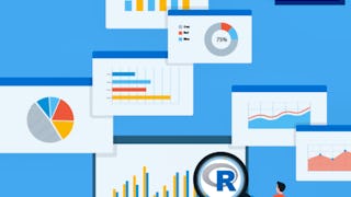
  • Data Visualization and Dashboards with Excel and Cognos: IBM
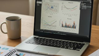
  • Getting Started with Data Visualization in R: Johns Hopkins University
  • Data Visualization using Plotly: Coursera Project Network
  • Seaborn with Python: Data Visualization for Beginners: EDUCBA
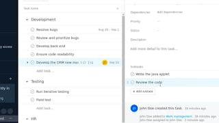
  • Use RACI charts for work management with Asana: Coursera Project Network
  • Advanced Data Visualization with R: Johns Hopkins University
  • Loops and Strings: Google
  • Tableau, Networks & Time Series Data Visualization: University of Pittsburgh
  • Data Visualization in Stata: Packt
  • Data Visualization for Genome Biology: University of Toronto

Other topics to explore

Arts and Humanities
338 courses
Business
1095 courses
Computer Science
668 courses
Data Science
425 courses
Information Technology
145 courses
Health
471 courses
Math and Logic
70 courses
Personal Development
137 courses
Physical Science and Engineering
413 courses
Social Sciences
401 courses
Language Learning
150 courses

Coursera Footer

Skills

  • Artificial Intelligence (AI)
  • Cybersecurity
  • Data Analytics
  • Digital Marketing
  • English Speaking
  • Generative AI (GenAI)
  • Microsoft Excel
  • Microsoft Power BI
  • Project Management
  • Python

Certificates & Programs

  • Google Cybersecurity Certificate
  • Google Data Analytics Certificate
  • Google IT Support Certificate
  • Google Project Management Certificate
  • Google UX Design Certificate
  • IBM Data Analyst Certificate
  • IBM Data Science Certificate
  • Machine Learning Certificate
  • Microsoft Power BI Data Analyst Certificate
  • UI / UX Design Certificate

Industries & Careers

  • Business
  • Computer Science
  • Data Science
  • Education & Teaching
  • Engineering
  • Finance
  • Healthcare
  • Human Resources (HR)
  • Information Technology (IT)
  • Marketing

Career Resources

  • Career Aptitude Test
  • Examples of Strengths and Weaknesses for Job Interviews
  • High-Income Skills to Learn
  • How Does Cryptocurrency Work?
  • How to Highlight Duplicates in Google Sheets
  • How to Learn Artificial Intelligence
  • Popular Cybersecurity Certifications
  • Preparing for the PMP Certification
  • Signs You Will Get the Job After an Interview
  • What Is Artificial Intelligence?

Coursera

  • About
  • What We Offer
  • Leadership
  • Careers
  • Catalog
  • Coursera Plus
  • Professional Certificates
  • MasterTrack® Certificates
  • Degrees
  • For Enterprise
  • For Government
  • For Campus
  • Become a Partner
  • Social Impact
  • Free Courses
  • Share your Coursera learning story

Community

  • Learners
  • Partners
  • Beta Testers
  • Blog
  • The Coursera Podcast
  • Tech Blog

More

  • Press
  • Investors
  • Terms
  • Privacy
  • Help
  • Accessibility
  • Contact
  • Articles
  • Directory
  • Affiliates
  • Modern Slavery Statement
  • Manage Cookie Preferences
Learn Anywhere
Download on the App Store
Get it on Google Play
Logo of Certified B Corporation
© 2025 Coursera Inc. All rights reserved.
  • Coursera Facebook
  • Coursera Linkedin
  • Coursera Twitter
  • Coursera YouTube
  • Coursera Instagram
  • Coursera TikTok